Identification of duplications, insertions or LOH that segregates with a disease phenotype
CNViewer is designed to allow the visual comparison of copy number (CN state) and loss of heterozygosity (LOH) data from Affymetrix SNP 6.0 microarrays between affected and unaffected members of a pedigree. The program aims to allow the identification of regions where the values of either the CN state or the LOH scores are the same in all the affected individuals, but none of the unaffected individuals have the same value. As well as visualising the CN state and LOH data, the program will also display Log(2) ratio, smooth signal and allele difference values that may also be obtained from the Affymetrix SNP 6.0 array (details on how to export the data are here). CN state, Log(2) ratio and the smooth signal data may be derived from either the SNP or CNV probes on the SNP microarray chip, where as the LOH and allele difference values are derived solely from the SNP probes.
System and data requirements
CNViewer is designed to run on Windows XP or later operating systems that have the .NET 2.0 framework
installed; the latter is freely available from
Microsoft.
Genotyping should be performed using the Affymetrix SNP 6.0 array.
Importing the data
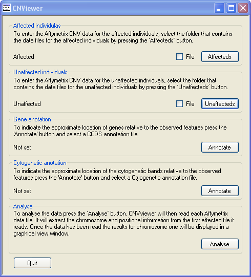
Figure 1
CNV data is selected by pressing the and the buttons in turn and navigating to the data files. For each of the affected and unaffected data sets, it is possible to select and view either a single file or a folder of files. To select a single file check the tick box by the appropriate button and navigate to the file. To view a number of files, make sure the tick box is cleared, place the data files for the affected individuals in a single empty folder and the files from the unaffected individuals in a second empty folder and then press the appropriate button and navigate to the folder (Figure 1). It is possible to view a single affected's data file and a folder of unaffected's data files or visa versa. It is possible to sequentially enter new data files from affected individuals and CNViewer will only overwrite the data from affected patients and not the data from unaffected 'control' individuals. While CNViewer does need data from affected individuals, it is not required from unaffected individuals.
It is possible to annotate the position of any structural feature with reference to its genomic position, the regions Giemsa-stain chromosomal bands are genes in the region. The chromosomal banding and gene position data can be imported by pressing the relevant button in the Gene annotation and Cytogenetic annotation panel. To import genes position data press the button in the Gene annotation panel select a plain text file containing the relevant Consensus CoDing Sequences (CCDS) data. Similarly, to import banding information, press the button in the Cytogenetic annotation panel and select a plain text file containing the relevant information on the position of the Giemsa-stained chromosome bands. A CCDS file (hg19 co-ordinates) can be downloaded from this site here and a file containing the cytogenetic band data can be downloaded here here.
Reading the data
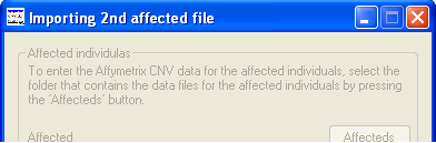
Figure 2
Once a folder containing data from affected individuals has been selected the button becomes activity. Pressing this button causes the data in each file to be entered in to a SNP and CNV probe data base. Since the data files may be very large, containing data for approximately 2 million probes, this phase may take a couple of minutes. The current status of the analysis is displayed in the programs title bar (Figure 2). Once all the data has been imported a second window is opened which displays data as shown in Figure 3.
Viewing the CNV and LOH data
The data display window initially displays the CN state values along chromosome 1 as either one (Figure 2 A) or two graphs (Figure 3 B) depending on whether the current analysis contains data for unaffected individuals. Since the operation of CNViewer is not affected by the absence of data from unaffected individuals for this user guide it will be assumed that unaffected individuals are present in the analysis. These graphs are displayed in the Data display panel, the upper graph contains data from the affected individuals, while the lower graph contains data from the unaffected individuals (Figure 3). Each graph is drawn as a scatter graph with each probe's score plotted on the y-axis and its chromosomal position plotted on the x-axis. Initially, each chromosome is plotted to the same scale such that the data for chromosome 1 spans the enter graph. The chromosomal position is marked along the x-axis of the lower graph in Mbs. If a probe's value falls outside the range of a graph's y-axis it is drawn on the graph at either the maximum or minimum position allowed. However, if the data is exported the probe's true value is reported.
If coding sequence data from a CCDS file is entered, the location of any genes in the region will be shown at the very bottom of the graphical display. Each gene is drawn as a black rectangle with smaller rectangles representing the genes exons. If the gene is on the positive strand the exons are coloured green while genes on the negative strand are coloured orange (Figure 3 B). These features become visible when the program 'Zooms' in on a selected region i.e. Figures 5, 7 and 8. If cytogenetic banding information is entered, this can be displayed by selecting the option in the Annotation data panel (on the right of the window below the graphical display). If the cursor is placed over a band, its name is shown in the windows title bar (highlighted by the red ellipse in Figure 3 C).
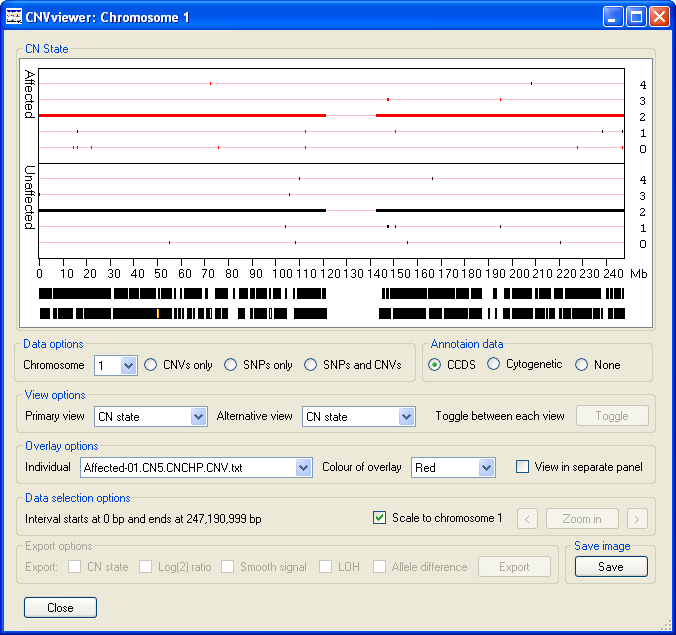
Figure 3 A
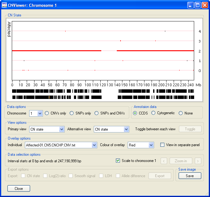
Figure 3 B
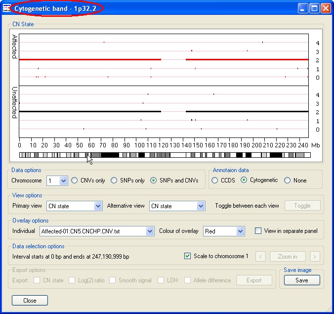
Figure 3 C
Data display options
The options to adjust the data display are below the Data display panel and grouped into four panels; the
Data options panel, the View options panel, the Overlay options
panel and the Data selections options panel. Finally, the data Export options and
Save image panels are located at the bottom of the window.
These are explained in greater detail below.
Data selection options
When the data is initially displayed, the selected chromosome is changed or the window is resized, the x-axis extends from 0 to ~250 Mb. However, since many clinically important features may be quite small it is possible to select a region and 'zoom in', such that this region spans the entire x-axis. To select a specific region, place the mouse cursor at the start of the region and move the cursor to the other end of the region while holding down the left hand mouse button. This should cause the selected region to be flanked by two vertical red lines (Figure 4), then by pressing the button the selected region will be displayed in greater detail (Figure 5). The button will then be relabeled and pressing it again or mouse clicking the Data display panel will display the data for the whole chromosome. Either side of the button are two smaller buttons ( and ), pressing either of the buttons moves the data shown in the graph to the left or right such that the old and new display regions overlap by 10% of their width. If a CCDS annotation file was imported, it should be possible to see individual genes and by placing the cursor over a gene its name will be displayed in the windows title bar (highlighted by a red ellipse in Figure 5).
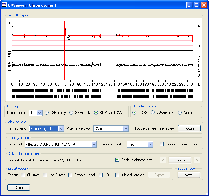
Figure 4
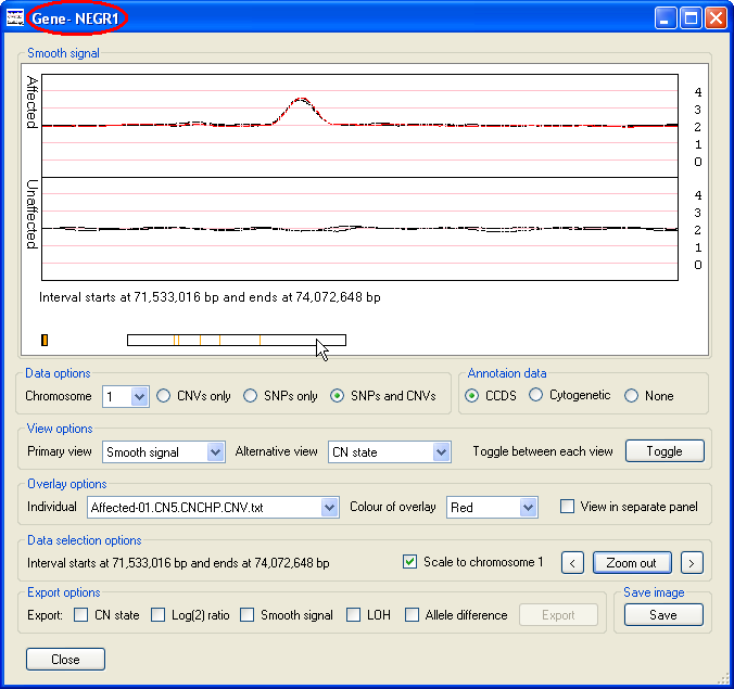
Figure 5
Overlay options
The Overlay options panel contains the option (highlighted by the red rectangle in Figure 6), selecting this option displays the data as three graphs, with the upper and lower graphs showing the data for the affected and unaffected individuals respectively, while the middle graph contains the data for a specific file (Figure 6). This file is chosen using the drop down list in the left hand side of the Overlay options panel. If the selected file contains the data from an affected individual, the data points are also overlaid on the upper Affecteds graph. Similarly, selected data from an unaffected individual is displayed on the lower Unaffecteds graph. The colour of these data points can be selected using the drop down list in the centre of the Overlay options panel (highlighted by the blue rectangle in Figure 6).
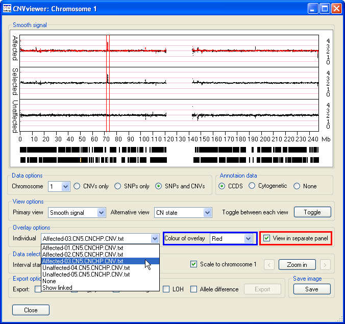
Figure 6
As well as containing the names of the files in the analysis, the dropdown list box also contains the and options. If the option is selected, no data is overlaid on either graph. If the and either the CN State or LOH options are selected then the overlaid data and middle graph (if displayed) contains only the probe values where all the affected individuals have the same value, but none of the unaffected individuals have the same score (Figure 7). This makes it easier to see features that are common to the affected group but absent from the unaffected group. For example in Figure 7 a small region of LOH at approximately 35 Mb is highlighted in the middle graph and the overlaid as red data points in the upper graph. This region of LOH is present in all the affected individuals data, but is absent from all the unaffected individuals.
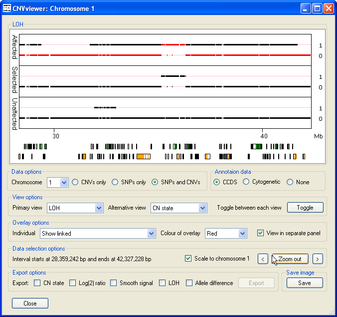
Figure 7
Similarly, Figure 8 identifies the presence of a duplicated region at ~71 Mb and a deleted region at ~75.5 Mb that are present in the data from affected individuals, but is absent from the data from unaffected individuals. By zooming into these regions it can be seen that the duplication contains data from a numerous of probes, while the deleted region appears to contain of very few probes.
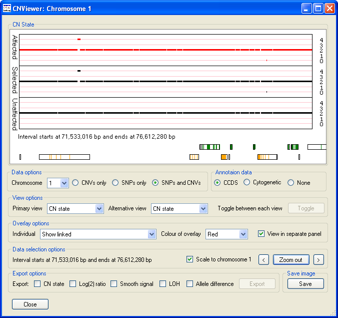
Figure 8
View options
The View options panel allows the user to select which parameter is displayed in the graphs, by selecting
one of the options in the or dropdown lists (see
the 'Toggle button' section for an explanation for the use of the and
dropdown lists).
Each option is described below:
- The values range from 0 to 4 with normal diploid sequences having a score of 2. Typically, a normal person contains a number of very small regions of possible copy number variation which can be seen as small dots occurring at positions 0, 1, 3 and 4 on the y-axis (Figure 9).
Figure 9
- The displays the raw data from which the CN state and Smooth Signal values are derived and typically have values ranging from 4 to -4, with a mean value of 0. Short regions of chromosomal amplification or deletion can be identified as a series of data points projecting from the other data points that are clustered around the 0 position of the y-axis. For example, on chromosome 1, the data points suggesting a duplication at 72 Mb and deletions at the positions of 114 and 151 Mb can be seen (Figure 10).

Figure 10
- The option displays the same data as the option, however the data has been processed by the Affymetrix's Genotyping Console to provide a clearer view of the trends in the copy number data. As well as the data points highlighted in the description of the option above (Figure 10), other spikes are visible (Figure 11). While a Log(2) ratio value associated with a SNP or CNV probe is derived from that probe, the smooth signal value is calculated using the intensity values of the flanking probes. Consequently, a probe may have a Log(2) ratio value of 0, but have a smooth signal value of anywhere between 0 or 4 depending on the Log(2) ratio values of the surrounding probes.
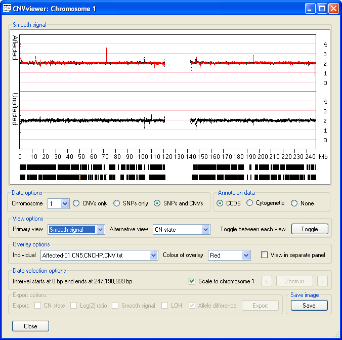
Figure 11
- The values are either 0, for no loss of heterozygosity or 1, for loss of heterozygosity , with the vast majority of SNPs probes having a value of 0 in a typical individual (Figure 12). LOH is detected as an extended run of SNPs that do not contain heterozygous SNPs. Consequently, a region may be scored as LOH if either the sequence has been lost from one of the chromosome pairs or the individual is autozygous across the region. Since, LOH status cannot be determined from the CNV probes, the selection of the , or options in the Data options panel are ignored and the data from the SNP probes are always.
Figure 12
- The values are used to calculate the LOH score (Figure 13). These scores can range from 5 to -5, but typically form a trinomial distribution about the values 2, 0 and -2, where values around 0 represent heterozygous SNPs, while homozygous SNPs have a value of approximately 2 or -2. As when viewing the LOH data the , or options in the Data options panel are ignored and the data is derived solely from the SNP probe intensity data.
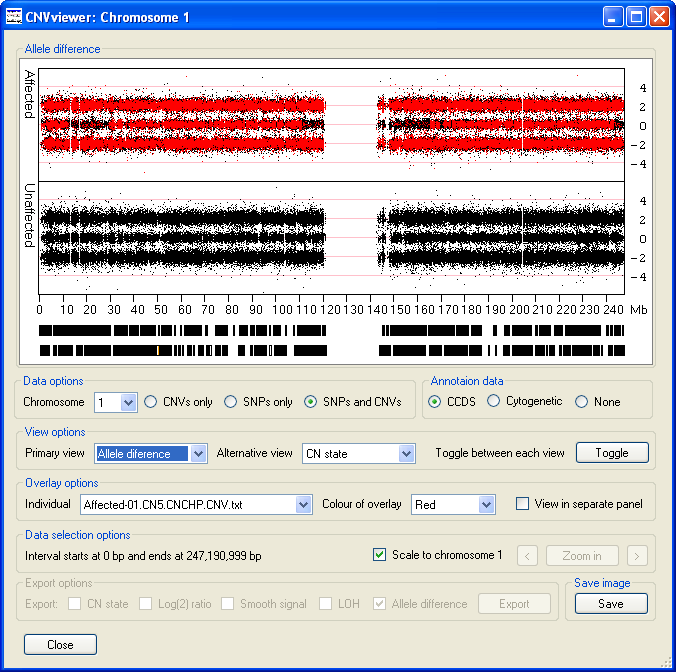
Figure 13
The 'Toggle' button
If the values selected in the and the lists differ, the button is enabled, pressing this button causes the data displayed in the Data display panel to alternate between the data series selected from each of the lists. By rapidly pressing the button it is possible to quickly alternate between the two different views, making it is possible to easily compare the raw probe values to the process data values. For instance it is possible compare the processed CN state values with the raw Log(2) ratio values shown in Figure 8 (Figure 14).
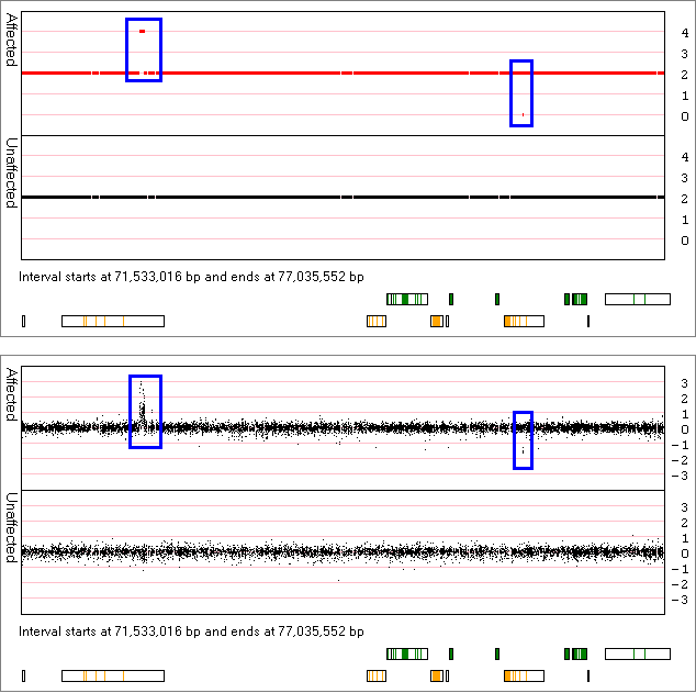
Figure 14
Data options panel
This panel allows the user to select which chromosome is displayed in the graphs using the drop down list in the left hand side of the panel. Typically, each file contains data for all the autosomal chromosomes plus both the sex chromosomes, but not the mitochondrial chromosome. While the LOH and allele difference scores are only derived from the SNP probes, the CN state, Log(2) ratio and Smooth signal values are generated from both CNV and SNP probe sets. Therefore it is possible to view the later values from the SNP probe data only, the CNV probe data only or both probe sets using the , or options to the right of the chromosome selection list. By comparing the presence of a feature in the data derived from the SNP probes to the data from the CNV probes it is possible to confirm if that feature is genuine or an artifact of the analysis of a particular probe type. However, it must be noted that CNV probe Log(2) ratio values are more sensitive than those calculated from SNP probes. Since the LOH and Allele difference data originates solely from the SNP probes, when these parameters are viewed, the selection the , or options are ignored.
While CNV probes are evenly distributed across the genome, SNP probes are underrepresented in regions known to contain common structural variants, by viewing data derived from SNP probes only it is possible to detect these regions. For instance Figure 15 displays the CN state values of markers on a region of chromosome 17 that contains no SNP probes (Figure 15 A), but does contain CNV probes (Figure 15 B).
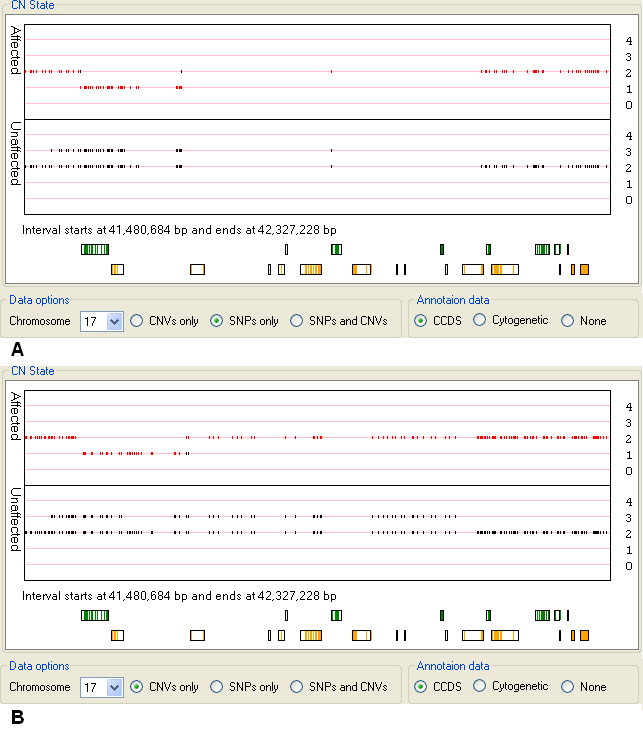
Figure 15
Exporting data
It is possible to export the data as either an image of the currently displayed graph, or as a tab-delimited text file of the probe data in the currently
selected region.
To save an image of the current graph, first adjust the size of the window until the graph is the desired size, next select the desired region and display
options and finally press the button in the Save image panel in the bottom right corner of the
CNViewer window.
To export the data values for each probe in a specific region as a text file, first select the region of interest by placing the mouse cursor at the start
of the region and then moving the cursor to the other end of the region, while holding down the left hand mouse button. This should cause the selected region
to be flanked by two vertical red lines (Figure 16). Next, select the data parameters you wish to include in the exported data file using the options in
the Export options panel. Finally, press the button and enter the name of the file you wish to
save the data too. The data is then saved as a tab-delimited text that can be viewed and manipulated in a spread sheet application such as Excel (Figure 17).
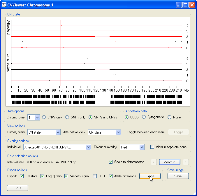
Figure 16
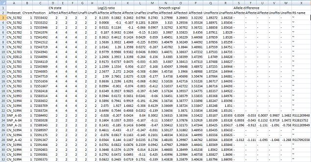
Figure 17